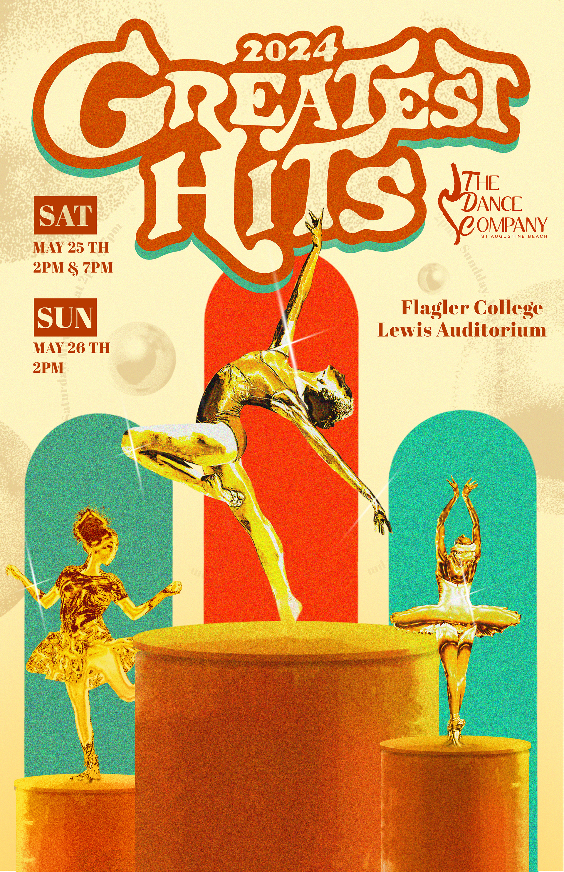
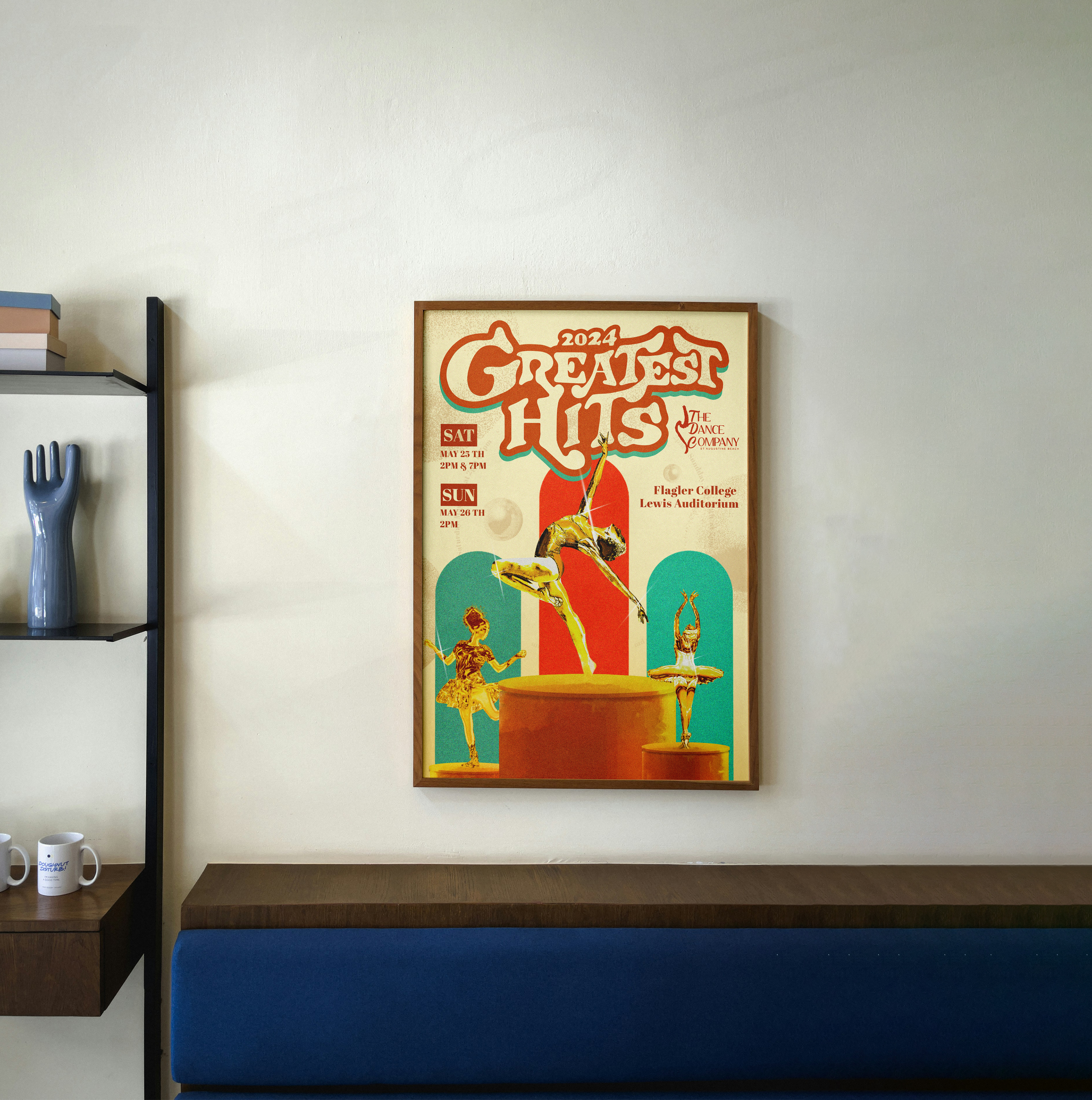
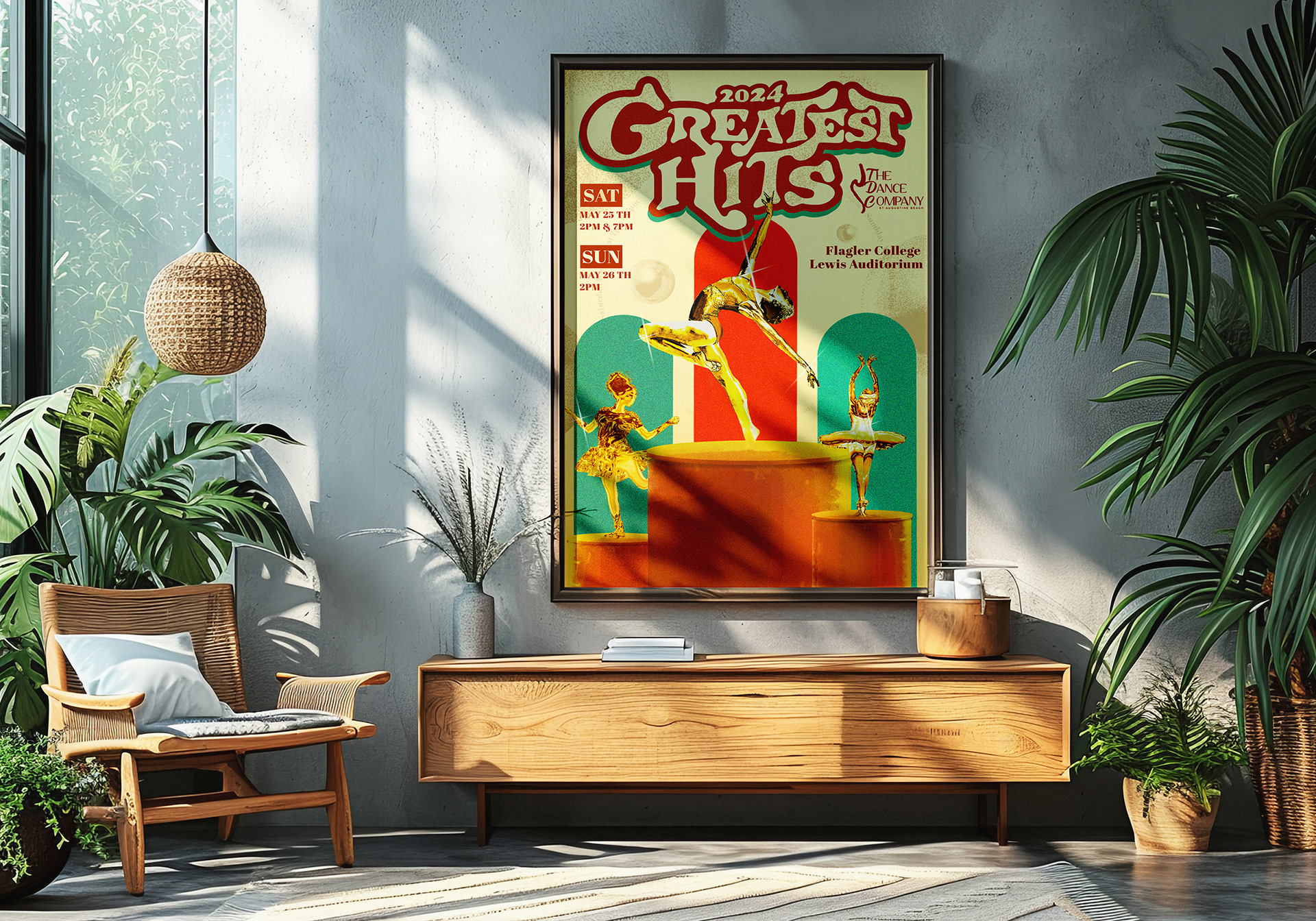
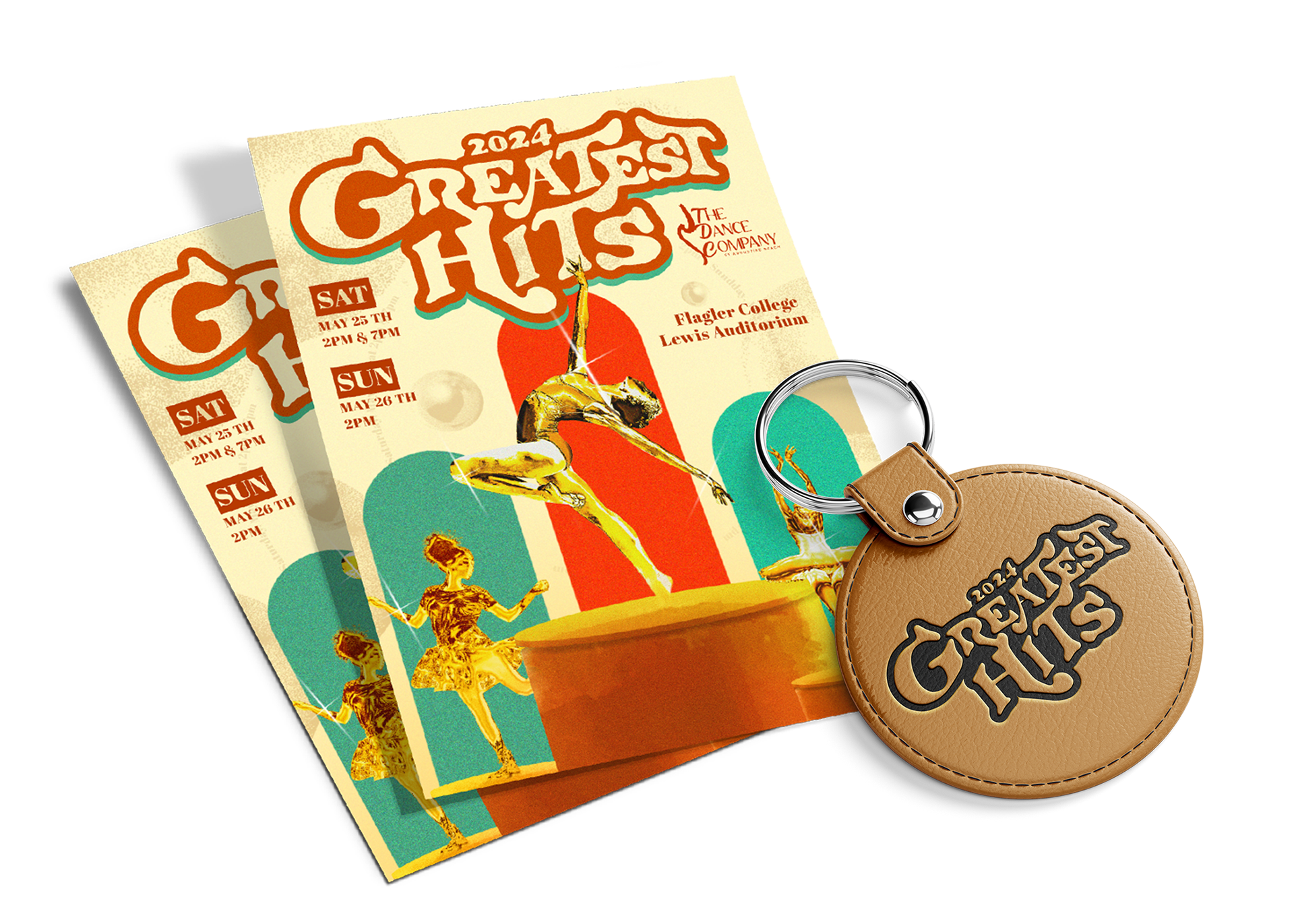
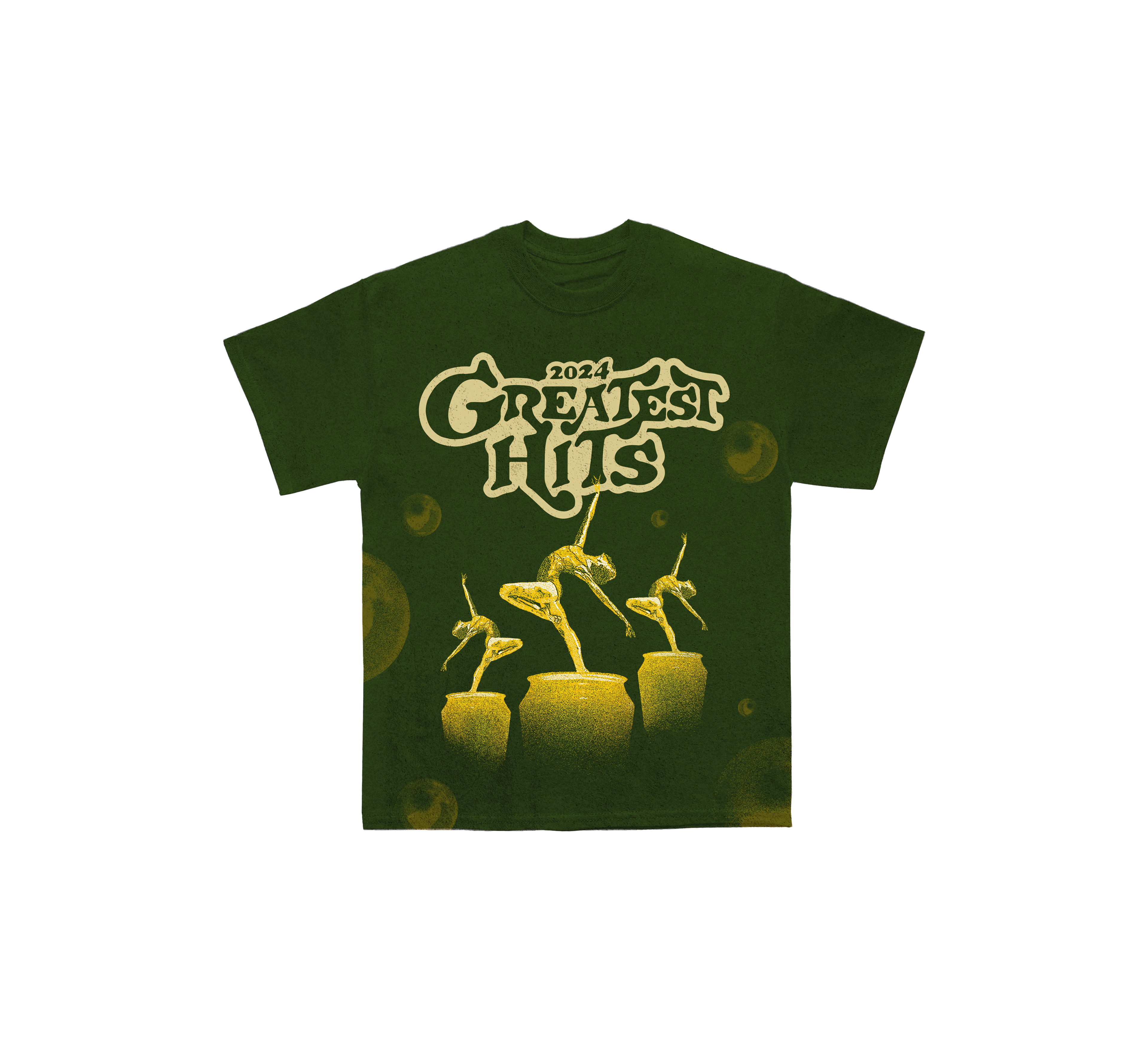
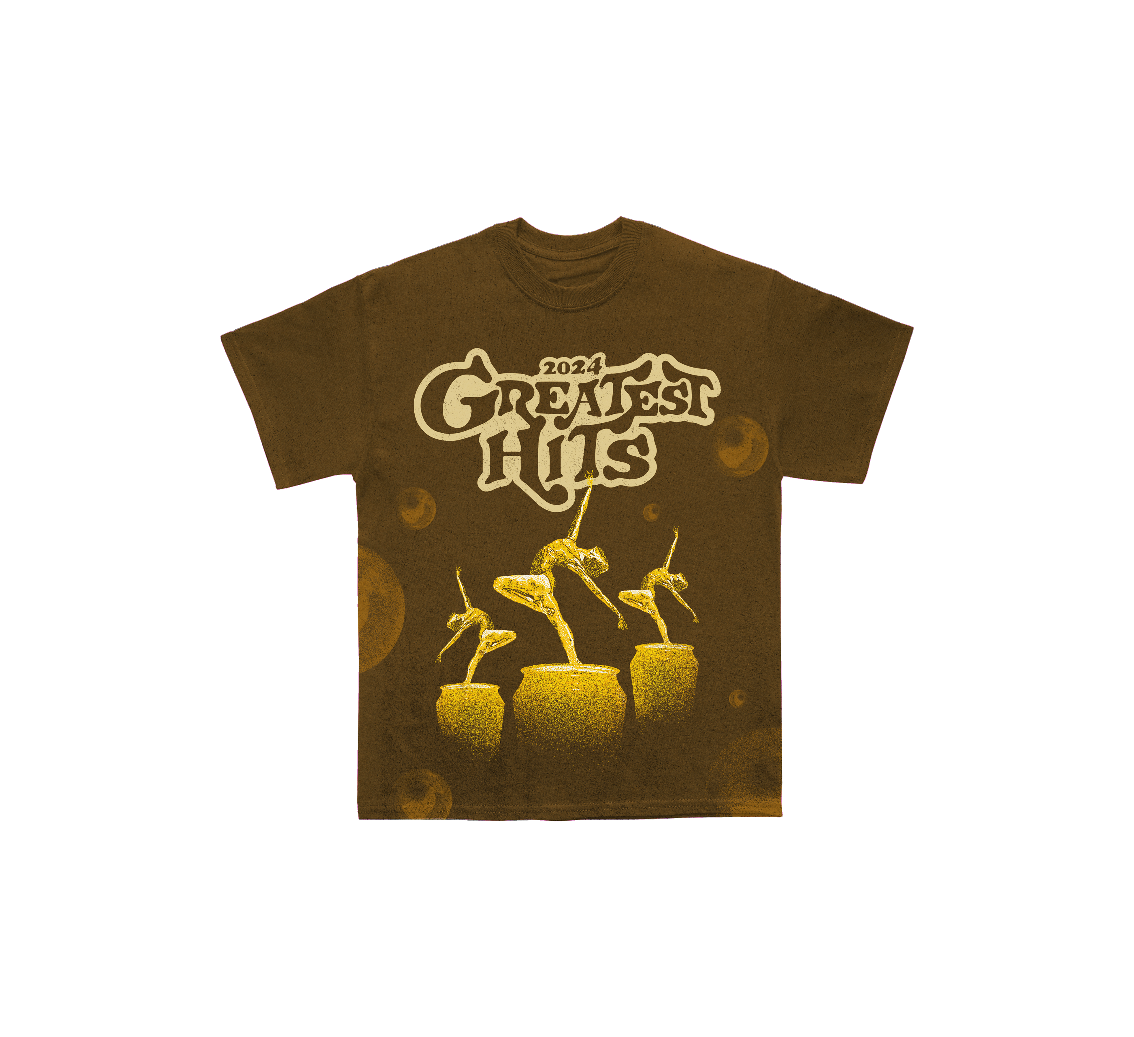
In shaping this project, my main focus was on integrating color and movement seamlessly. The dancer's stance in the 30th-anniversary logo set the tone for the design's direction.
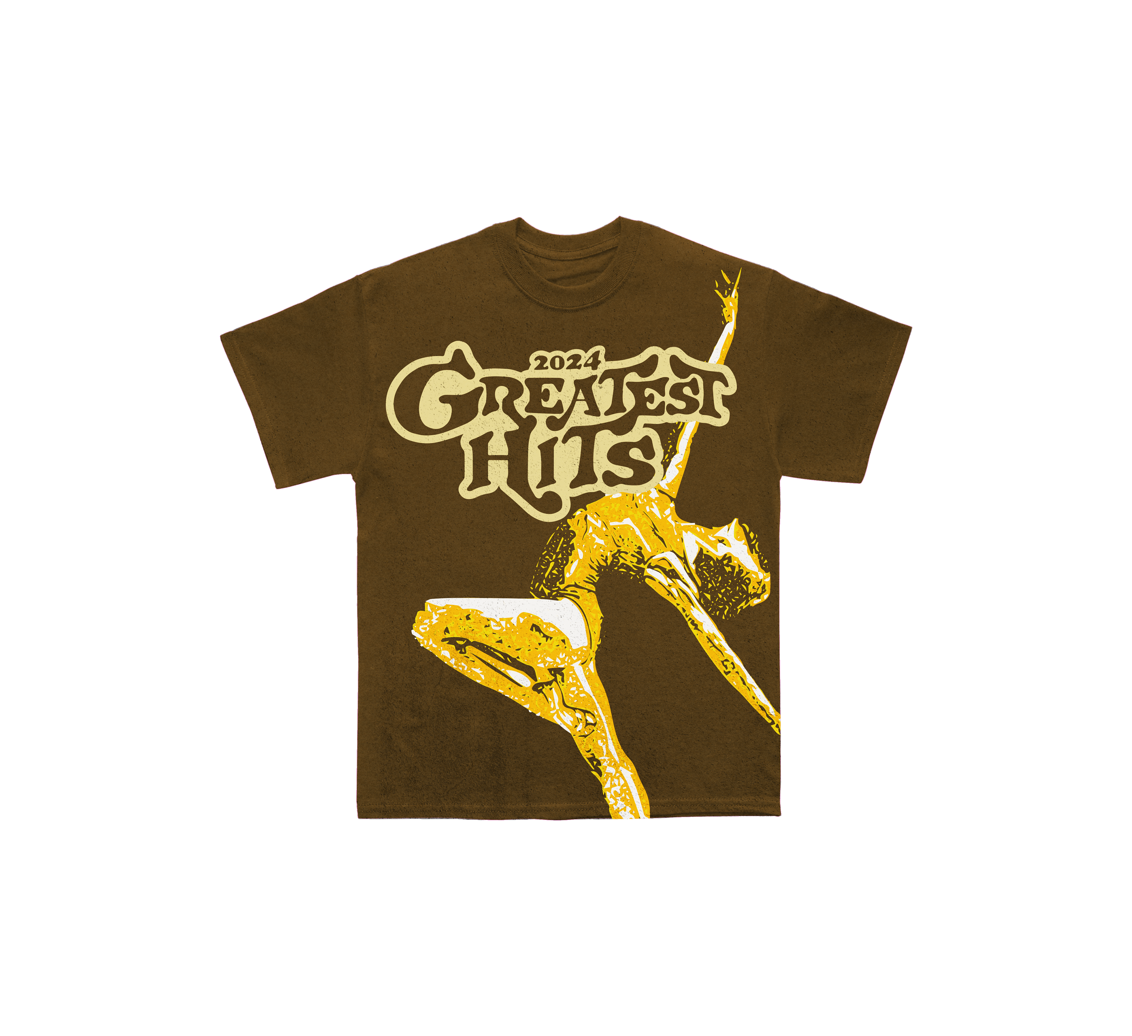
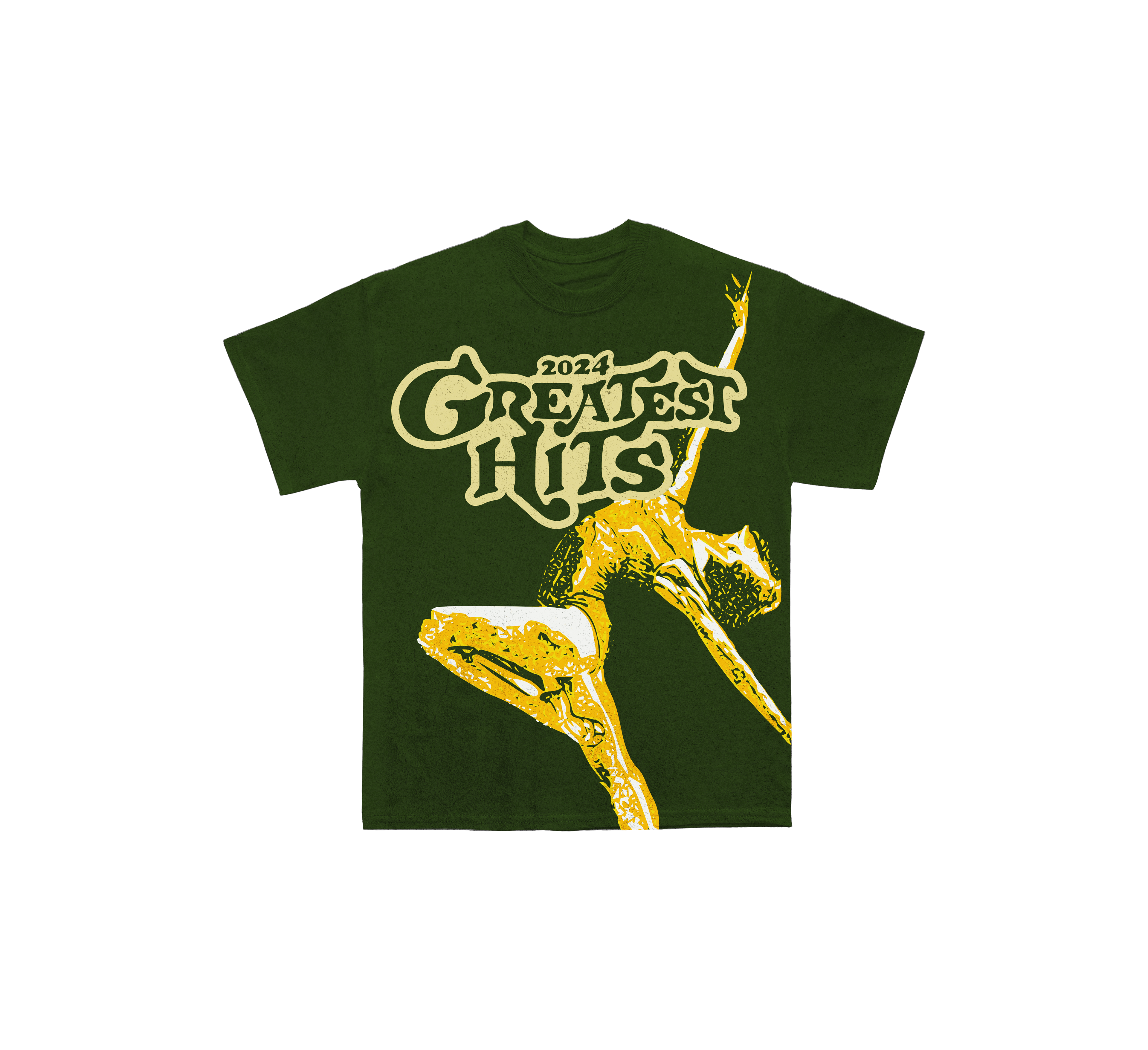
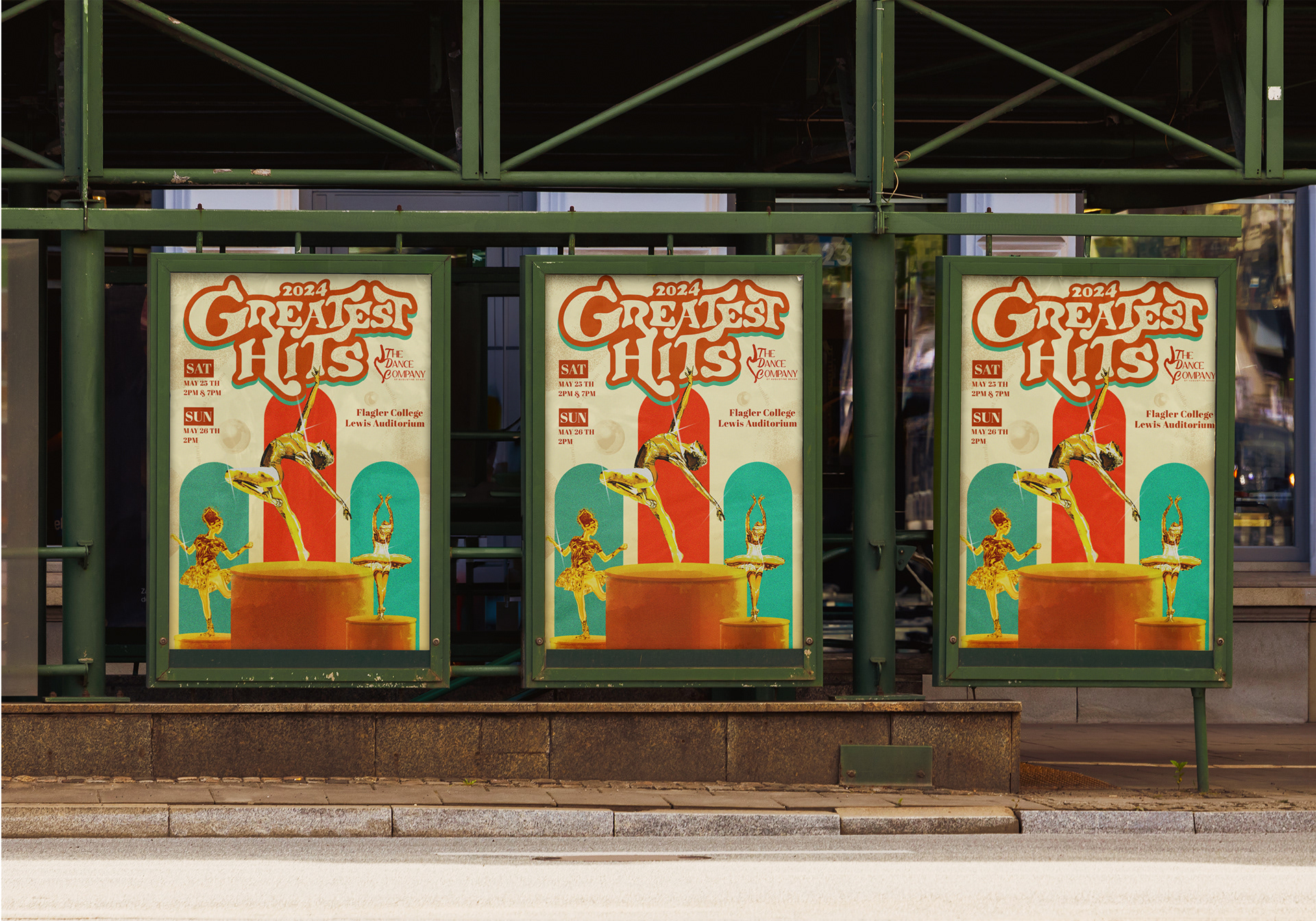
Within the poster, the pillars and typography create a sense of flow, reminiscent of a bygone era. The color palette, featuring blues, greens, reds, and off-white/tans, evokes a vintage feel. Which correlates to the idea of greatest hits. For the shirt designs, I opted for a neutral brown to contrast with the vibrant yellows and oranges from the poster, adding a retro touch. The colors and elements nod to past successes while hinting at future endeavors.